Understanding how to read candle charts is essential for any aspiring trader. These charts visually represent price movements and trends, offering valuable insights into market behavior. By learning to interpret candles and recognizing common patterns, traders can make more informed decisions. This guide will walk you through the basics and practical applications of reading candle charts. The latter will eventually help you navigate the volatile world of cryptocurrency trading.
Introduction to Candle Charts
Candlestick charts trace their origins back to 18th-century Japan, where rice traders developed the method to track market prices and emotions. Adapted for modern financial markets, these charts now serve as a fundamental tool for analyzing cryptocurrency price movements and trends.
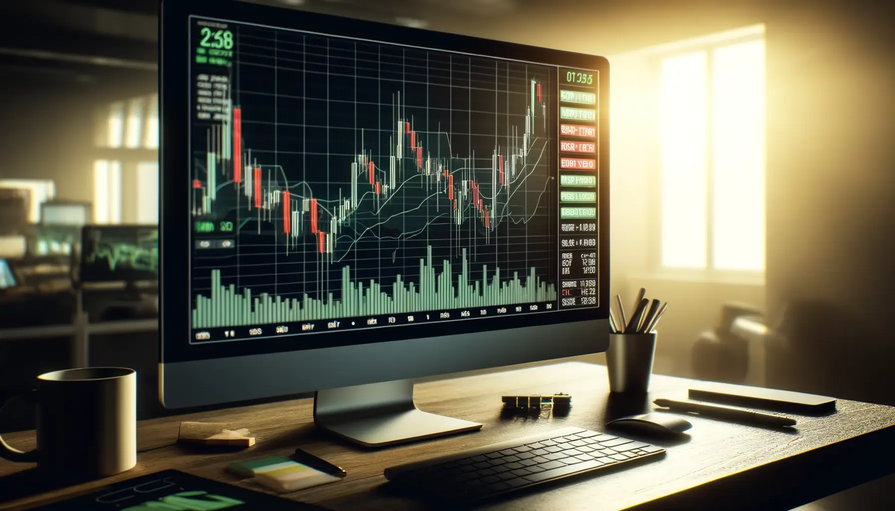
In short, candlestick charts are graphical representations of price movements over a specified period. They show opening, closing, high and low prices. Each ‘candle’ in the chart encapsulates these four key data points and provides a clear and concise visualization of market activity.
Their purpose is to help traders identify patterns and trends whilst facilitating more informed decision-making. By analyzing these charts, traders can gauge market sentiment and predict potential future price movements.
Structure of a Candlestick and Other Chart Types
Candlesticks are composed of three main components: the body, the wick (or shadow), and the color.
First, the body represents the range between the opening and closing prices of the asset within the chosen time frame.
Then, the wicks extend from the body to indicate the highest and lowest prices during that period.
Finally, the color of the body typically signifies market direction: a green or white body indicates a price increase (bullish), while a red or black body indicates a price decrease (bearish).
While bullish candles indicate a rise during the selected period, they have a lower opening price and a higher closing one which signals positive market sentiment.
On the other hand, bearish candles show a price decline where the opening price is higher than the closing one. The latter, then reflects negative market sentiment.
There are also other charts with different features:
- Line Charts (They only display closing prices over time compared to candlestick ones which are more detailed, with open, high, low, and close prices)
- Bar Charts (They, however, have a less intuitive format)
Therefore, candlestick charts are more valuable for technical analysis and allow traders to recognize patterns and make predictions with greater accuracy.
Understanding Individual Candlesticks
To read a candlestick, start by identifying the body, which represents the range between the opening and closing prices. The top of the body shows the closing price for a bullish candle (price increase) or the opening price for a bearish candle (price decrease).
The wicks extend from the body to indicate the highest and lowest prices reached during the period. The upper wick shows the high price, while the lower wick shows the low price. This gives a full picture of the price movement.
There are different types of candlesticks which are the following:
Two types of bullish candlesticks:
- Hammer: Signals a potential reversals in downtrends. It also indicates strong buying pressure after a decline.
- Bullish Engulfing: This occurs when a smaller bearish candle is followed by a larger bullish one and completely engulfs the previous day’s body. This signals a potential upward trend.
Two types of bearish candlesticks:
- Shooting Star: It indicates potential reversals in uptrends. It also shows strong selling pressure after a rise.
- Bearish Engulfing: This one happens when a smaller bullish candle is followed by a larger bearish candle that completely engulfs the previous day’s body. It suggests a potential downward trend.
Neutral candlesticks:
- Doji: They indicate market indecision where the opening and closing prices are almost identical, which results in a very small or non-existent body.
Common Candlestick Patterns and Their Interpretations
Single candlestick patterns are individual candlesticks that provide insights into potential market reversals or continuations based on their shape and size as seen above.
Multiple candlestick patterns involve sequences of two or more candles that together indicate potential market trends or reversals. They include the following:
- Bullish Engulfing
- Bearish Engulfing
- Morning Star: A three-candle pattern with a large bearish candle, a small-bodied candle (doji or spinning top), and a large bullish candle. They signal a bullish reversal.
- Evening Star: The opposite of the morning star, with a large bullish candle, a small-bodied candle, and a large bearish candle. They indicate a bearish reversal.
- Three White Soldiers: Three consecutive long bullish candles with small or no wicks, suggesting a strong upward momentum.
- Three Black Crows: They’re three consecutive long bearish candles with small or no wicks, indicating a strong downward momentum.
- Harami: A two-candle pattern where a small candle is contained within the body of the previous larger candle, with bullish and bearish variations signaling potential trend reversals.
- Piercing Line: This is a bullish pattern where a long bearish candle is followed by a long bullish candle that opens lower but closes above the midpoint of the previous bearish candle.
- Dark Cloud Cover: That’s a bearish pattern where a long bullish candle is followed by a long bearish candle that opens higher but closes below the midpoint of the previous bullish candle.
Applying Candlestick Analysis in Trading
Combining candlesticks with other indicators like moving averages, RSI, and MACD enhances the accuracy of trading signals and trend confirmations.
Moving averages help identify the overall trend direction and potential support and resistance levels.
Relative Strength Index (or RSI) indicates overbought or oversold conditions.
The Moving Average Convergence Divergence (or MACD) provides insight into momentum and potential reversals by analyzing the relationship between two moving averages and their convergence or divergence.
Risk Management and Stop-Loss Levels
Risk management is crucial in trading to protect capital from significant losses and ensure long-term sustainability. Setting stop-loss levels helps limit potential losses by automatically closing a trade when the price reaches a predetermined level. This will prevent emotional decision-making. Finally, this disciplined approach minimizes risks and preserves funds, which allows traders to stay in the market and capitalize on future opportunities.
Written by
Siana Marcellus
Educator